Create Your First Project
Start adding your projects to your portfolio. Click on "Manage Projects" to get started
JASPER ART REBRANDING
Project type
Brand Development, Concept & Creative, Brand Research & Architecture
Team Members
Kelvin, Shu Xian & Suzanne
Role
Lead Designer
Client
Jasper Art
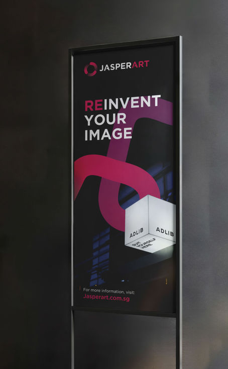
Jasper Art needed a rebrand to modernise their identity, stand out from competitors, and support their expansion into the global market.
At the heart of the new identity is their logo reinterpreted into a clean and sophisticated mark. The circular symbol, retaining a nod to their original logo that was inspired by ancient coins, features three dynamic elements representing Jasper Art’s founding trio and core values: digital-forwardness, service to humanity, and end-to-end signage solutions.
The new tagline, “Creating Impressions,” reflects Jasper Art’s 48-year legacy of helping businesses leave lasting impressions, while reinforcing their ability to adapt and innovate in a fast-evolving world.
Complementing the identity, fluid light lines were introduced as brand elements to visualise the energy and movement behind every brand Jasper Art brings to life. These lines echo the brand’s sense of progressiveness and adaptability, underscoring their commitment to delivering impactful, future-ready solutions.
Altogether, the rebrand presents a modern, timeless identity that strengthens Jasper Art’s position in both local and global markets, an impression that’s both bold and lasting.


